Root Cause Analysis Tip: You Know How to Perform a TapRooT® RCA but Where Do You Target Your Resources?
Let’s be honest: all companies want a good Return on Investment (ROI) on any investment. This is exactly why Mark Paradies and Linda Unger provide a section in our TapRooT®, Changing the Way the World Solves Problems book (2008) titled “A Guide to Improving the Use of TapRooT®.” The tip today focuses on Topic 2: Target Selection.
If you have set up good metrics to measure, you can start by looking for your Top Drivers in a Pareto Chart. If 80% of your issues are caused by or correlated to 20% of a sampled set of categories, then start there first for more ROI. Review the Chart below and then read the cautions below: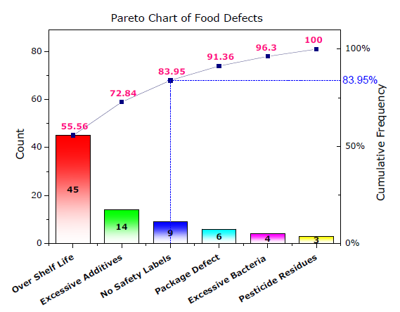
Cautions:
1. “Never Ever Ever” defines a category as “Miscellaneous” or “Other”! I promise you that it will always be in the Top Three every time.
2. When it comes to the y-axis on the Chart, do not just use Cost as a measurement; also use Risk and Frequency. One near miss may not have cost any money, but it could have killed someone. If you look at Cost or Frequency only, this would not show up as a Top Driver.


Another Quick Way to decide where to Target your resources is to use a Plot Map. Read more here as to how this map reduced illnesses from the water supply in certain areas.
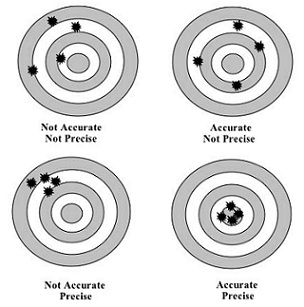
Finally, you may want to measure your improvements’ accuracy and precision. In earlier trending articles, we introduced the Process Behavior Chart. Below is one more example of how to measure Risk Reduction using a scatter and bulls-eye chart.
Here is a quick description of what the charts represent:
1. The Center (Bulls-Eye) of the chart represents that the risk targeted has been eliminated.
2. Each subsequent ring of the target indicates risk mitigation at lower levels (the outside rings do show risk mitigation but not as strong as the inner rings).
3. The dots indicate the actual risk level mitigated for each RCA performed with corrective actions implemented and verified for effectiveness (sounds like a SMARTER technique from class, doesn’t it?).
Looking at the charts above, which two Charts would you be happy with and why?