Fatalities Up … But Is the Change Statistically Significant?

Great Britan Workplace Fatalities Up By 28% But Is The Increase Statistically Significant?
I was reading an article in IOSH Magazine and it had the headline:
GB WORK FATALITIES UP BY ALMOST A THIRD
Whenever I see statistics and the headline seems to imply something (in this case a dramatic increase in fatalities), I always check things out and draw my own trending graphs.
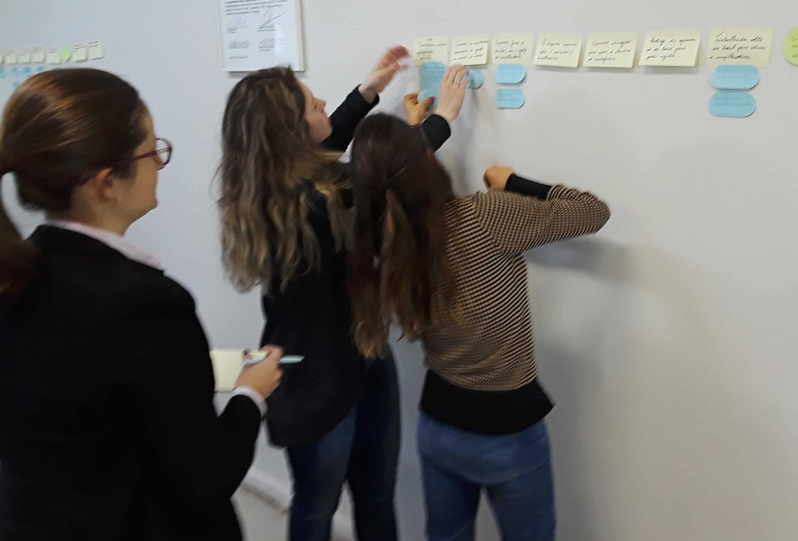
Therefore, I drew the Process Behavior Chart below (using data from Statista)…

I chose 12 years of data (a good but not perfect range of data) that started in 2010. It looked like this data was being produced from a fairly stable system and 12 data points are the minimum that I like to use to make a fairly stable graph (17 points is the recommended number of points).
I immediately saw that 2020 (actually 2019/2020) was low. The article explained that that was due to COVID (workers laid off and lockdowns).
That brings up the first topic. Shouldn’t these numbers be scaled by fatalities per 200,000 hours worked?
The second thing I noticed is that during this period, the number of fatalities was relatively flat. None of the data was outside the expected range (186-104 fatalities per year).
Thus, to answer our question in the headline, none of the changes from 2010 to 2021 are statistically significant. They are all within the upper and lower limits.
What would be significant? A year with more than 186 fatalities or a year with less than 104 fatalities.
If we continue in the next four years with fatalities in the range between 150 and 120, the variability of the statistics will decrease and the upper and lower limits will get tighter. That would mean that the upper limit could come down to in the 160s and it would take fewer fatalities to be a significant change.
Are You Interested in Analyzing Statistics?
If you are interested in using the type of graph I produced above to analyze safety statistics, you should read Book 8, Performance Measures and Trending for Safety, Quality, and Business Management.
To find out more about the book, see: