Improving Trending – Three Ways to Do It

Better Understanding of Trending
Would you like a better understanding of trending? Especially trending of infrequently occurring accident and incident statistics? Now there are three ways you can improve your trending knowledge:
- The book
- The 2021 Global TapRooT® Summit
- An on-site course
Read on for more information about common trending mistakes and how you can learn advanced mathematical techniques (advanced but not complicated) to improve your trending.
Common Trending Mistakes and Misuses
Let’s start with a quote from Mark Twain…
Figures often beguile me,
particularly when I have the arranging
of them myself; in which case the remark
attributed to Disraeli would often
apply with justice and force:
“There are three kinds of lies:
lies, damned lies, and statistics.”
I’m not sure if most trending problems are mistakes or people using trending to mislead.
I remember one of my first observations of misleading trending was two presentations just six months apart by the person responsible for trending incident statistics. In the first presentation, he demonstrated that the biggest problem we faced was human error. About 80% of the incidents were related to human errors. We obviously needed to attack this problem pronto!
Just six months later, the trend had changed. Now, 75% of the incidents were related to equipment failures. We obviously needed to focus on equipment reliability.
What had changed? Had our human performance improvement program solved all the causes of human error?
NO. In fact, the human performance improvement program had only been started about a month before the second presentation. No improvements had been implemented in the field. In fact, if one looked closely at the incidents, the causes were very similar to the previous six months.
Why, then, was the outcome of his trending analysis so radically different? Easy, he wanted to get support for a different program – equipment reliability improvement.
What happened? He categorized each incident with a single “major” cause. In the first six months, he was interested in human performance problems. He categorized the major cause in 80% of the incidents to be human error. By the second six months, his focus had changed. Human error was in the past. Now he was mainly interested in equipment problems. Therefore, he looked to equipment failures. Each incident with any type of equipment failure was categorized as an equipment failure.
Because most incidents have multiple causes, the exact same incident where a human error caused an equipment failure could have been categorized as a human error for the one report and as an equipment failure for the next report.
Thus, the first question you need to ask when a trend is presented is:
Where did these statistics come from?
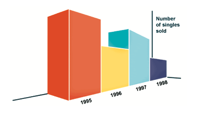
The next common charting/trending problem is the use of inappropriate graphs. For example, look at the graph below…

What’s wrong with this graph? Can you tell that the number of singles sold in 1995 is the same as the number sold in 1997? Also, can you tell how much variation from year to year is normal?
In this case, the author was trying to show a declining trend. This graph was useful for making his point.
What about the graph below used to demonstrate a government survey…

This isn’t a real pie chart. (It’s a pizza pie chart. 🙂 You have to read the percentages to get the message. The fine print has even more data. For example, onions are the second highest-rated topping (62%) but they don’t even show up on the chart while spinach (26%) does. Also, the percentages don’t add up to 100%. Why? Because people could vote for multiple toppings. What would be the result if you could only vote for one favorite topping?
So, the question is … Why did they use such a misleading chart? Who knows. Maybe they just got carried away with the artwork. But with any graph/trend, you need to ask yourself …
Does this make sense?
That’s certainly a question you should ask about the graph below…

I guess some people really don’t understand graphing or statistics!
Here’s another graph that misleads…

It shows welfare payments as increasing. That is true. But it tends to mislead on the rate of the increase. How? By truncating the data. Everything below 94M is cut off. This makes the increase look bigger.
The bar to the left is just 1/8th of the bar to the right. Actually, 96M is 90.5% of 106M. The visual makes a 9.5% increase look like a 400% increase.
This is just a small sample of bad graphs/trends that people use to prove their point. If you would like to learn all the tricks to misleading people with statistics, read How to Lie With Statistics by Darrell Huff. It’s an old book (1954) but is just as applicable today (maybe even more so) than it was when it was first published.

Best Trending Techniques
Now that you’ve seen a few bad trending techniques, what techniques should you be using? There are four:
- Pareto Charts
- Process Behavior Charts
- Interval Process Behavior Charts
- Rate Process Behavior Charts
Pareto Charts

You might think you know everything about Pareto Charts but we find that there are some features of Pareto Charts (and the 80/20 rule) that many people misunderstand. For example, when does the 80/20 rule NOT apply? Or, do you know when to use counts and when to use measures in displaying a Pareto Chart (as in the chart measured by the cost of incidents shown above)?
Process Behavior Charts
There are three types of Process Behavior Charts that you should understand and use. The standard Process Behavior Chart, the Interval Process Behavior Chart, and the Rate Process Behavior Chart.

The chart above is an example of a standard Process Behavior Chart. I won’t try to explain everything you can observe on the chart or what it is usually used for (trending performance over time) because there really is to much to explain in a short article. But I will say that I can’t imagine managing any kind of business without applying this technique.
Where Can You Learn About Advanced Trending Techniques?
Where can you learn about advanced trending techniques? That an easy question to answer.
FIRST, you can buy the book:
Performance Measures and Trending for
Safety, Quality, & Business Management by Mark Paradies.
For more information about the book, click on the picture above.
SECOND, attend the 2021 Global TapRooT® Summit (June 14-18) and attend the “Trending Techniques for Incident Data” session being presented by Mark Paradies from 2:45 to 3:45 on Wednesday.
The Summit is both a live, in-person event and a virtual event. For more Summit information, CLICK HERE.
FINALLY, if you have enough interest at your site, you can hold a 2-Day Trending to Manage Performance Course. For the complete course outline, CLICK HERE.
DON’T WAIT. Your trends can tell you where you need to be focussing your improvement attention. Pick one of the three ways to learn more and GET STARTED!


